

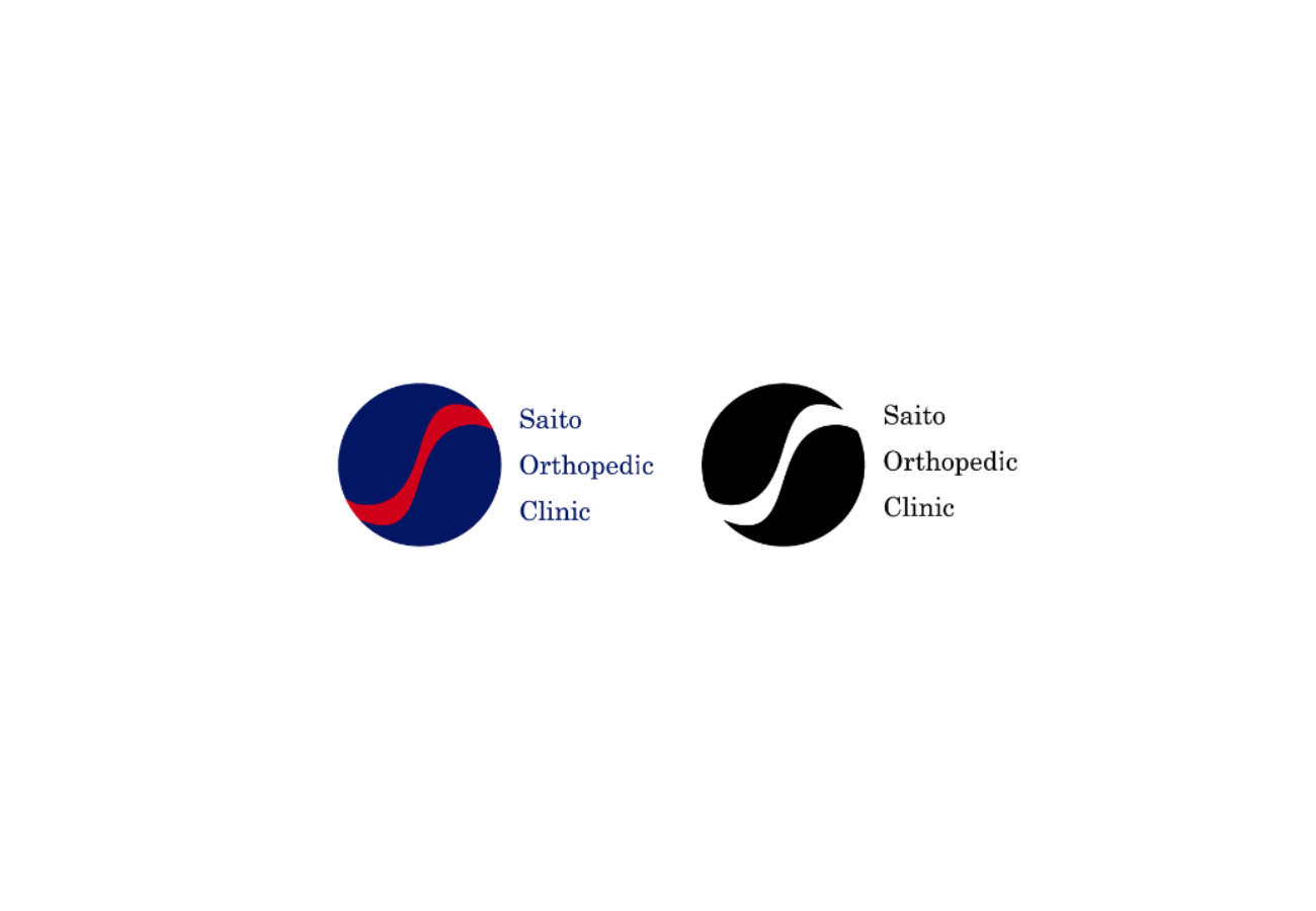
SOC [2016]
Client: Saito Orthopedic Clinic
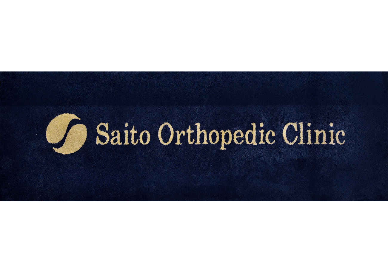
The client request was for a simple, yet compelling new logo for its orthopedic clinic. With that in mind, I designed a logo of blue and red, the two most popular colors in Japanese orthopedic clinics. As well, I sought to create a design that mirrored the orthopedic objective of healing and body harmony. The final logo incorporates two harmonious shapes with the letter ‘S’ running between them, creating a striking and memorable new visual for the clinic.
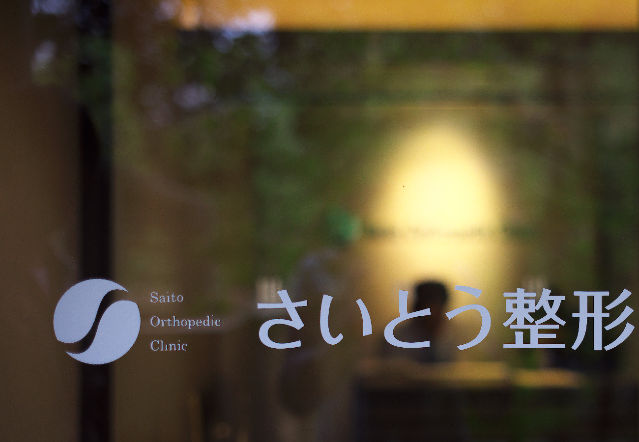
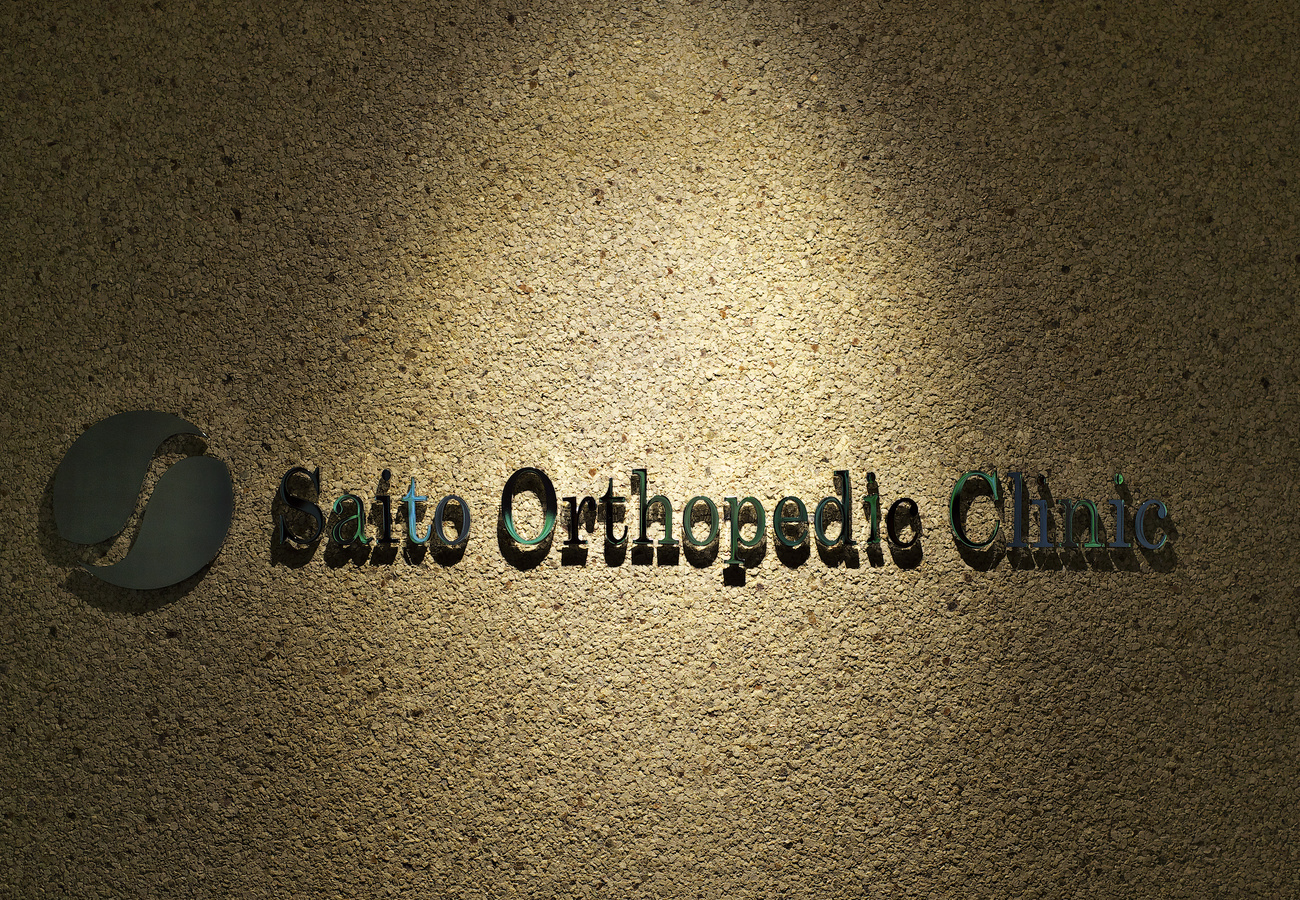
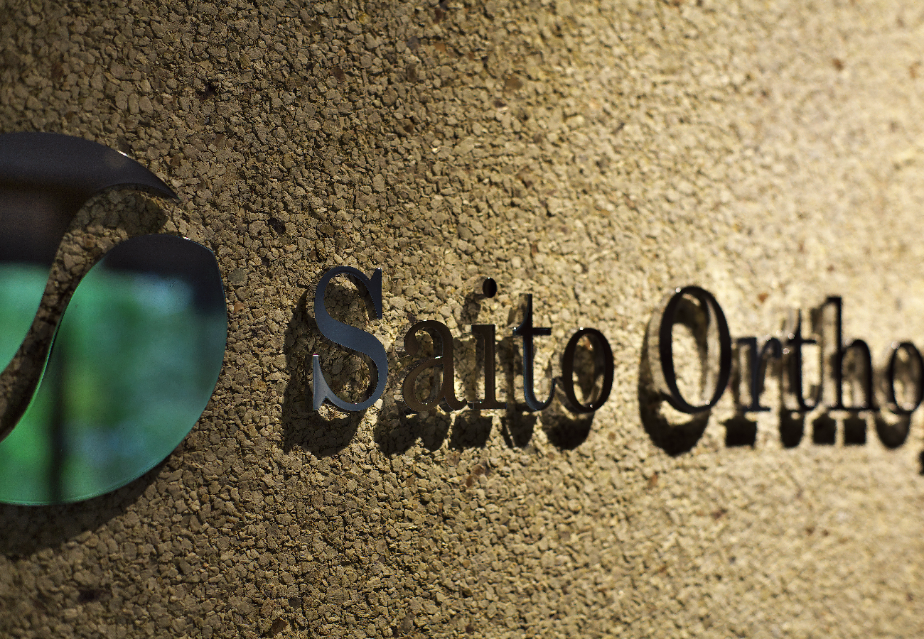
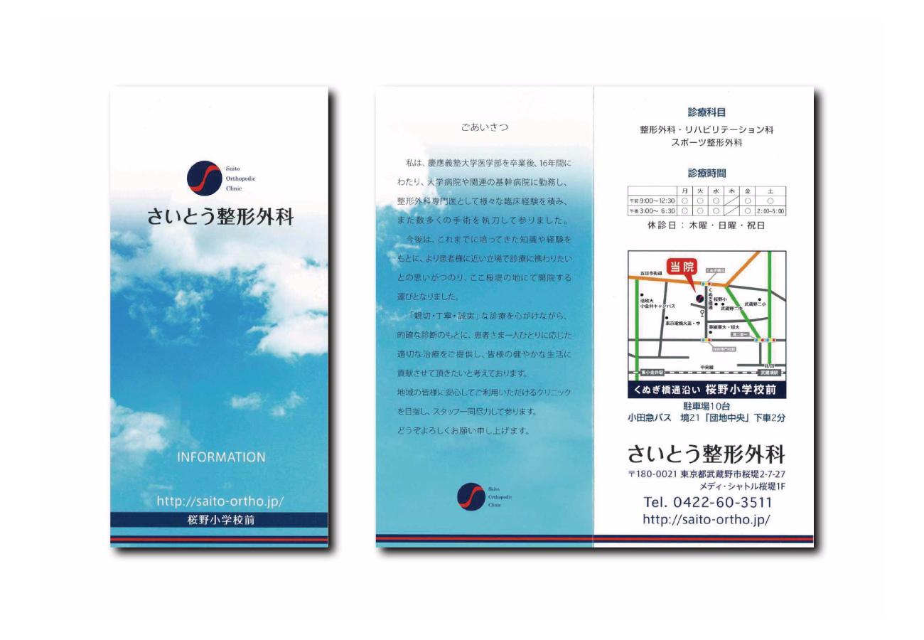
2016年、武蔵境に開業した整形外科様からのご依頼。
ロゴマーク・診察カード・パンフレット・サイン計画・その他備品デザインをトータルでディレクションしました。