Sから始まるブランディング [2016]
Branding
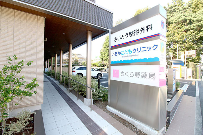
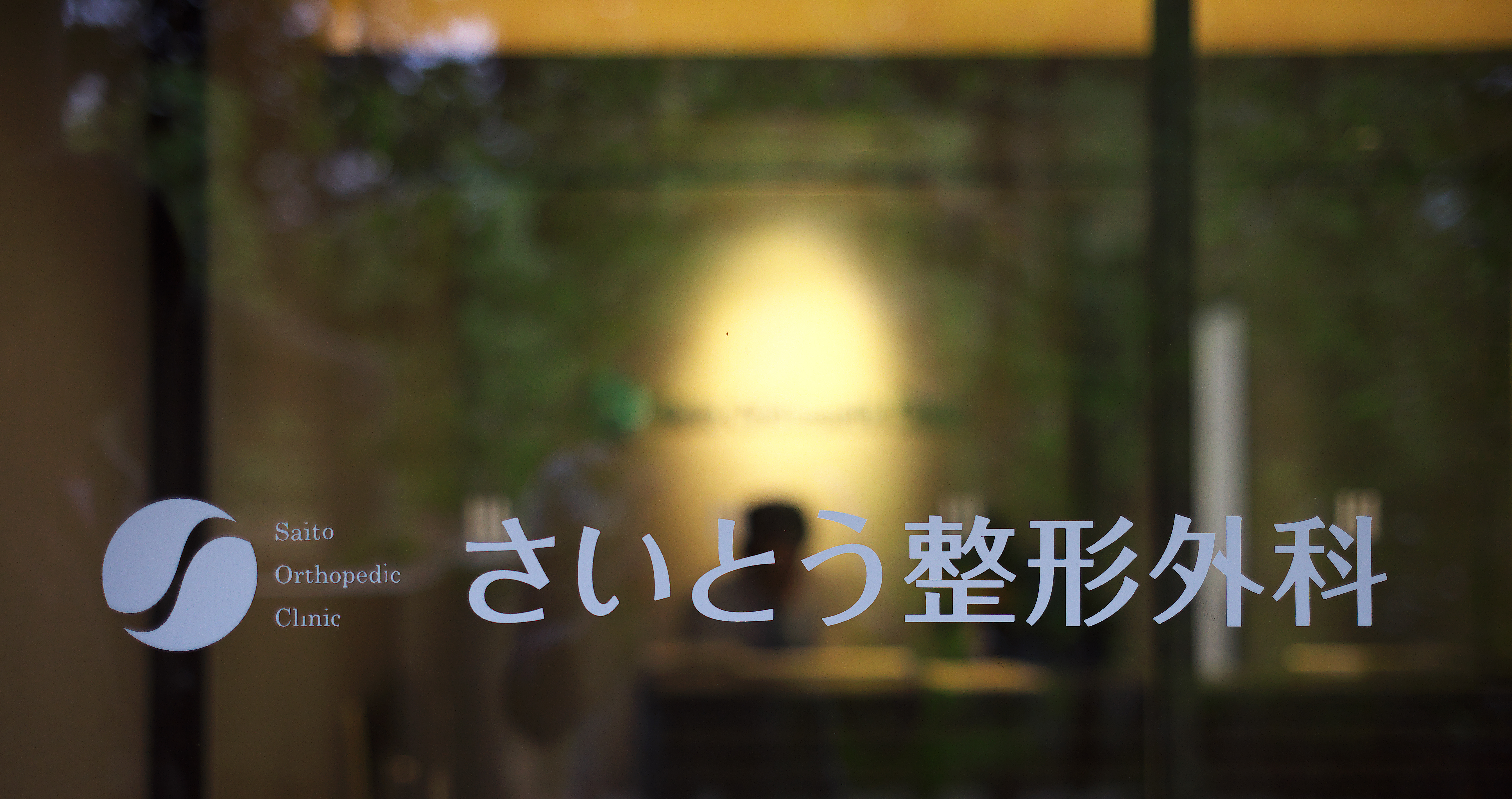
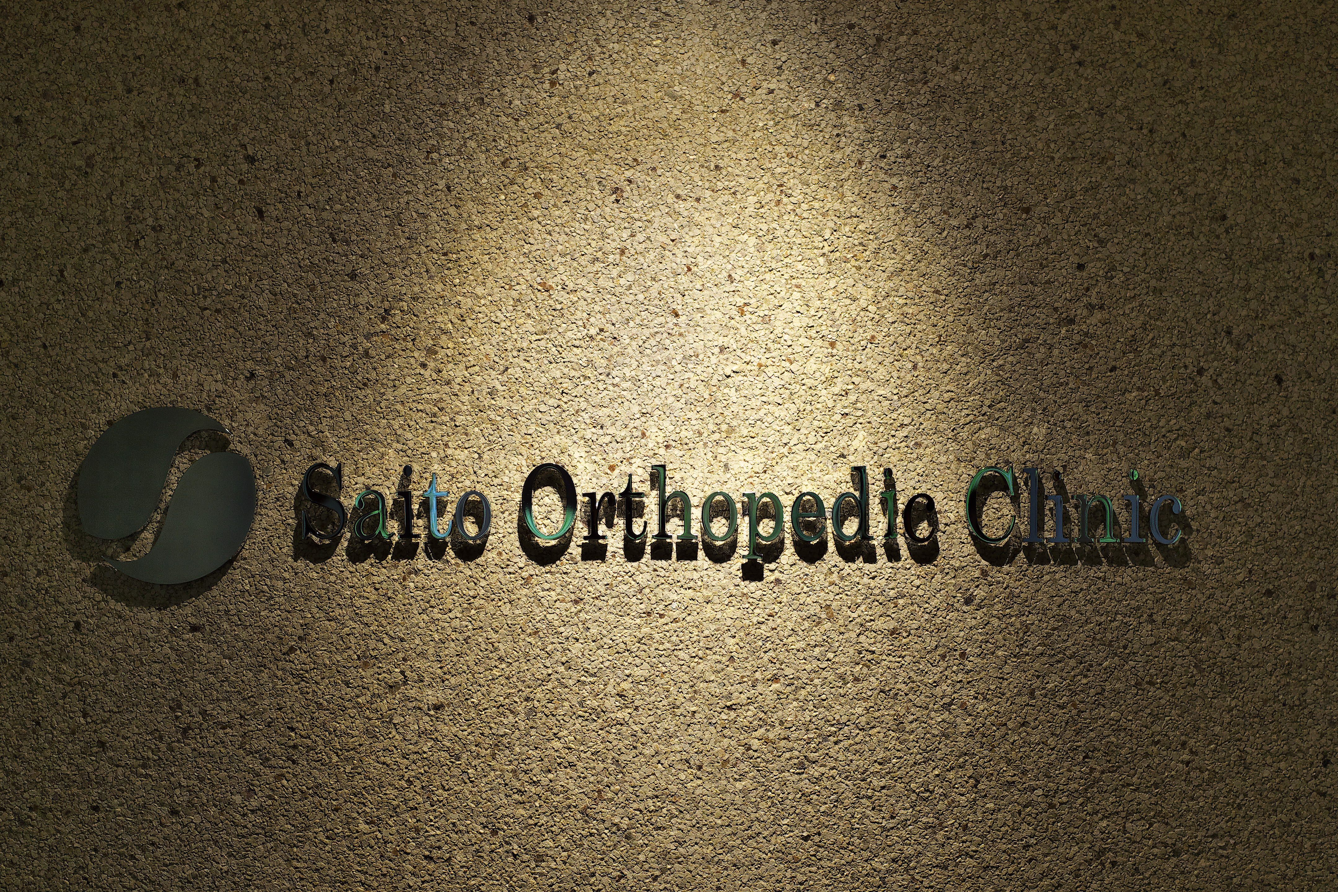
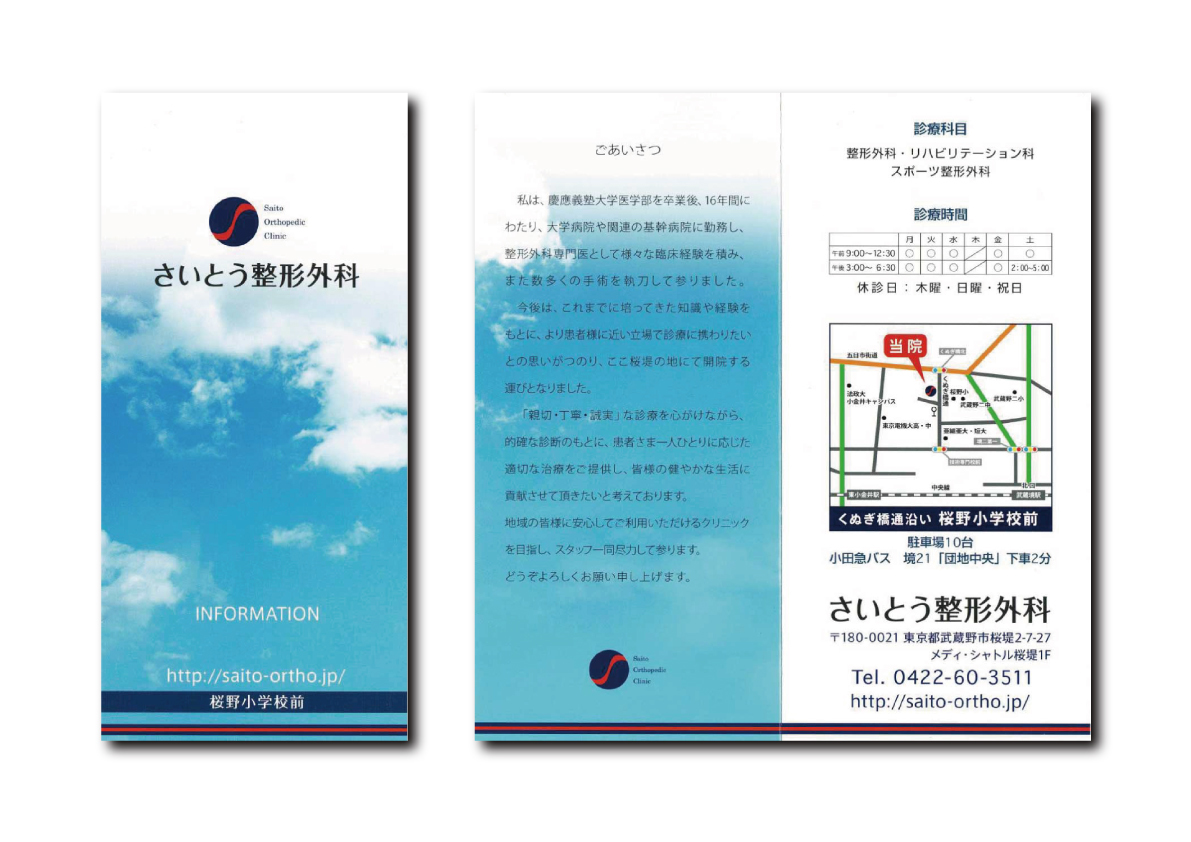
Client: さいとう整形外科
Direction: Yukimasa Hirota
Support: 東京電力
The client request was for a simple, yet compelling new logo for its orthopedic clinic. With that in mind, I designed a logo of blue and red, the two most popular colors in Japanese orthopedic clinics. As well, I sought to create a design that mirrored the orthopedic objective of healing and body harmony. The final logo incorporates two harmonious shapes with the letter ‘S’ running between them, creating a striking and memorable new visual for the clinic.
2016年、武蔵境に開業した整形外科様からのご依頼。さいとうのSをキーワードに整形外科を印象付ける骨の関節をイメージしたエンブレム・ロゴタイプを設計しました。配色は医院長が慶應卒ということから慶應カラーを採用。景観に溶け込みながらも自然と目に留まる効果を演出しました。また診察カード・パンフレット・サイン計画・備品に至るまでトータルブランディングを行うことで利用者にシームレスな心地よさを生みだします。